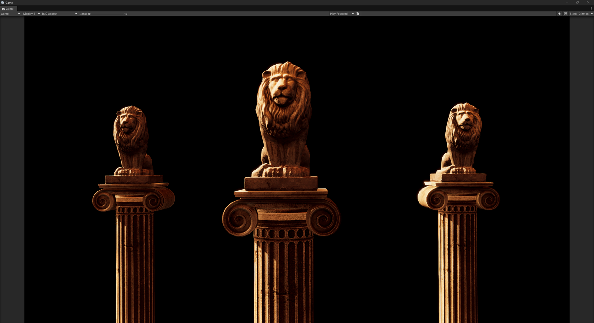
A monochromatic color palette has all the colors based on a single hue.
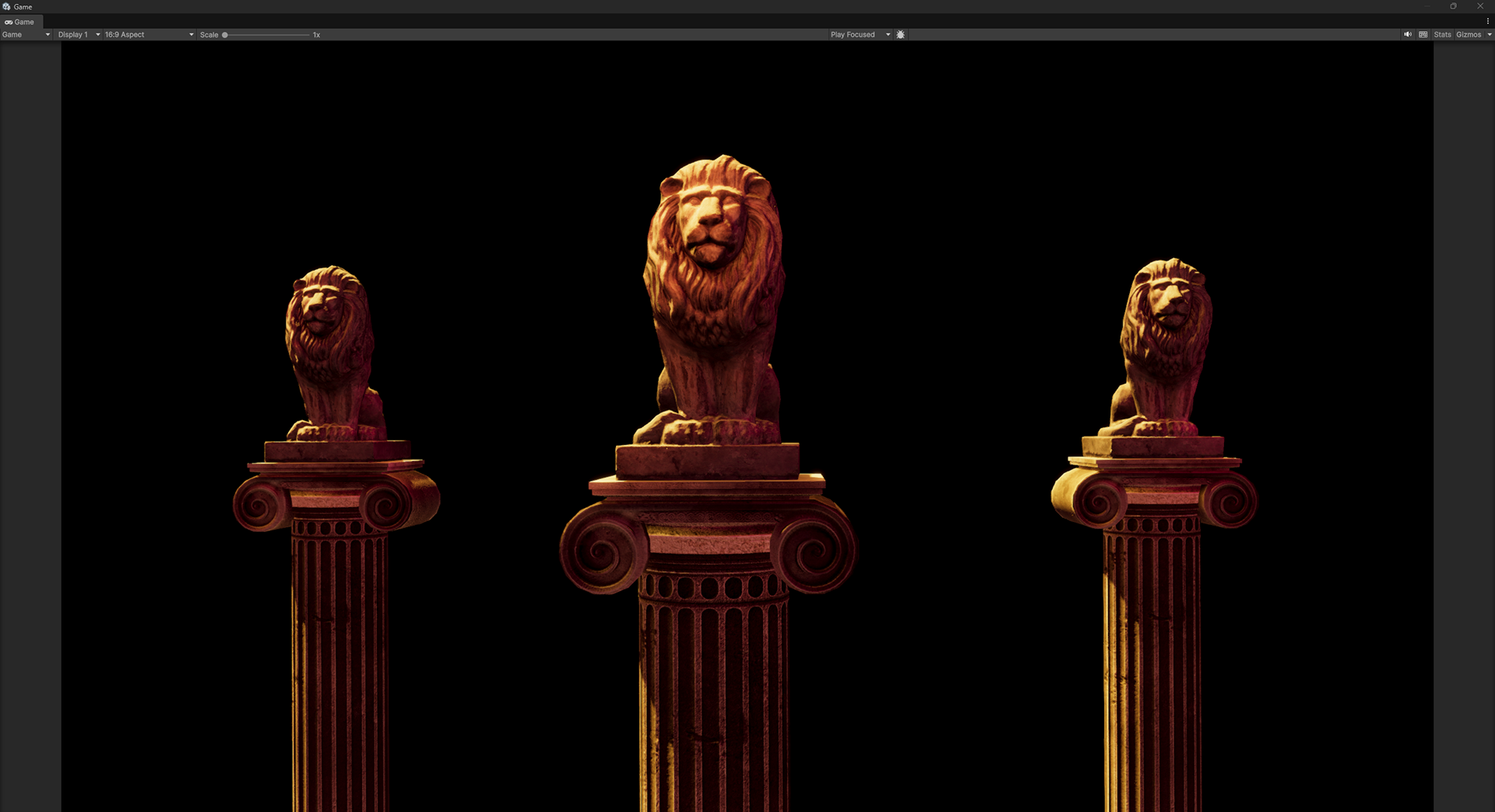
An analogous color palette is one where all the colors used are near each other in hue. It's similar to monochromatic, but it allows for richer harmonious color combinations.
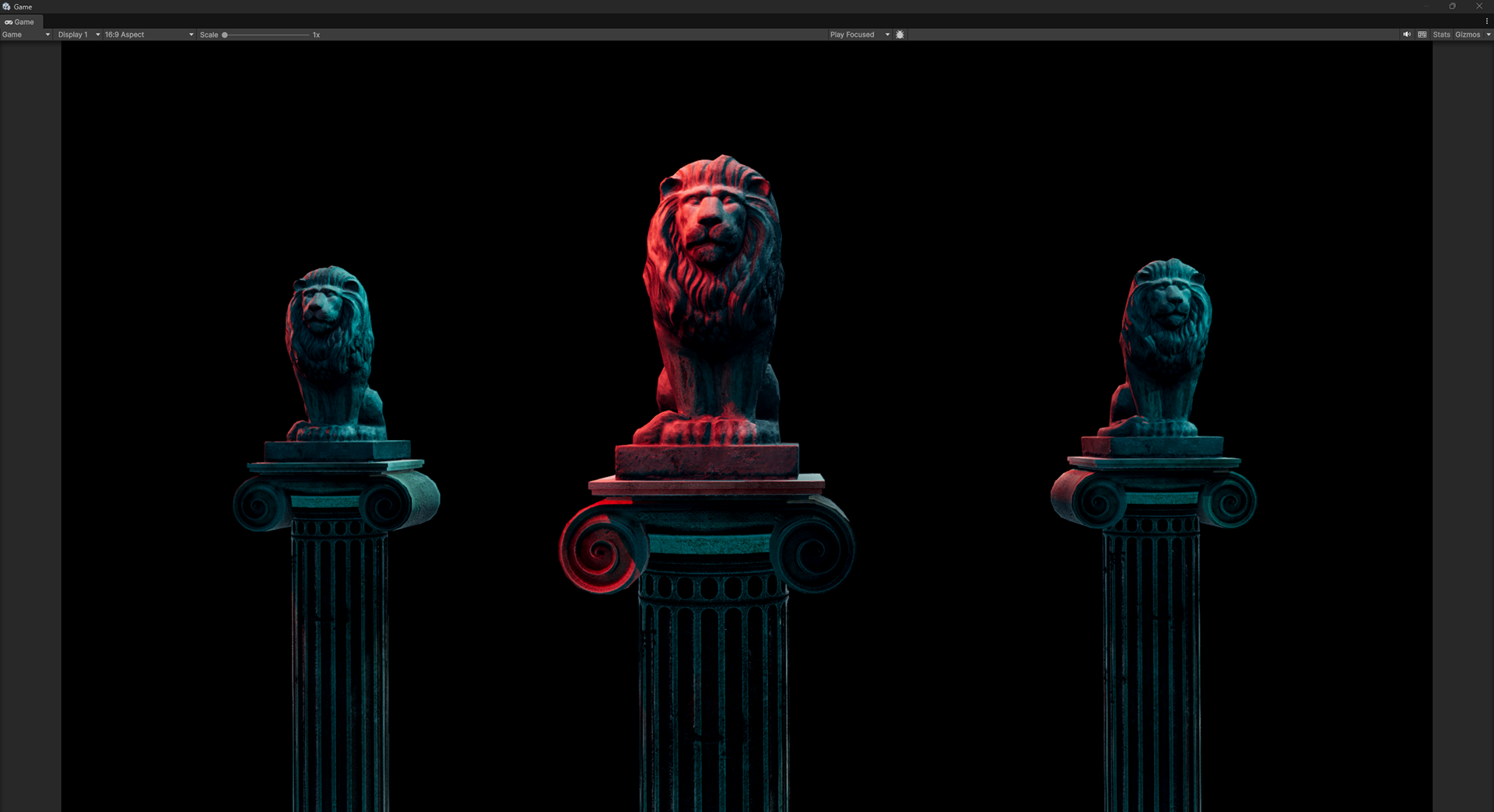
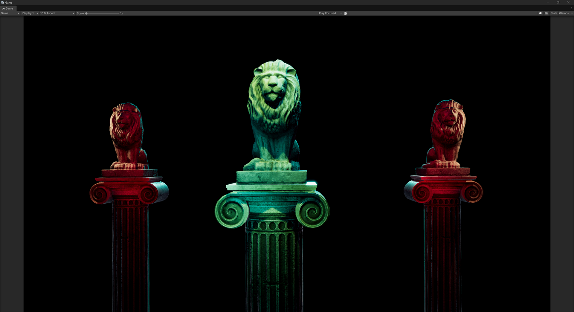
In a complimentary palette the colors are opposite each other (180 degrees) on the color wheel. You can get the compliment in a color picker by subtracting 1/2 the highest possible hue value from the color you want to find a compliment of. For example if your hue choices go from 0-360 and your primary color is 195, the compliment would be 15 (360-180=180. 195-180=15.)
Special note: There are a lot palette creation tools (including Adobe Color) in use that put green opposite red on the color wheel. Here's an article explaining why it could be considered incorrect: http://www.huevaluechroma.com/113.php
Here's a color palette tool that uses cyan as the compliment of red: https://www.colorharmonygenerator.com/
In a split compliment palette, the primary color is complimented by two colors that are on either side of the direct compliment.
A triadic palette is a little like a split compliment, but all the colors are roughly 120 degrees apart on the color wheel.
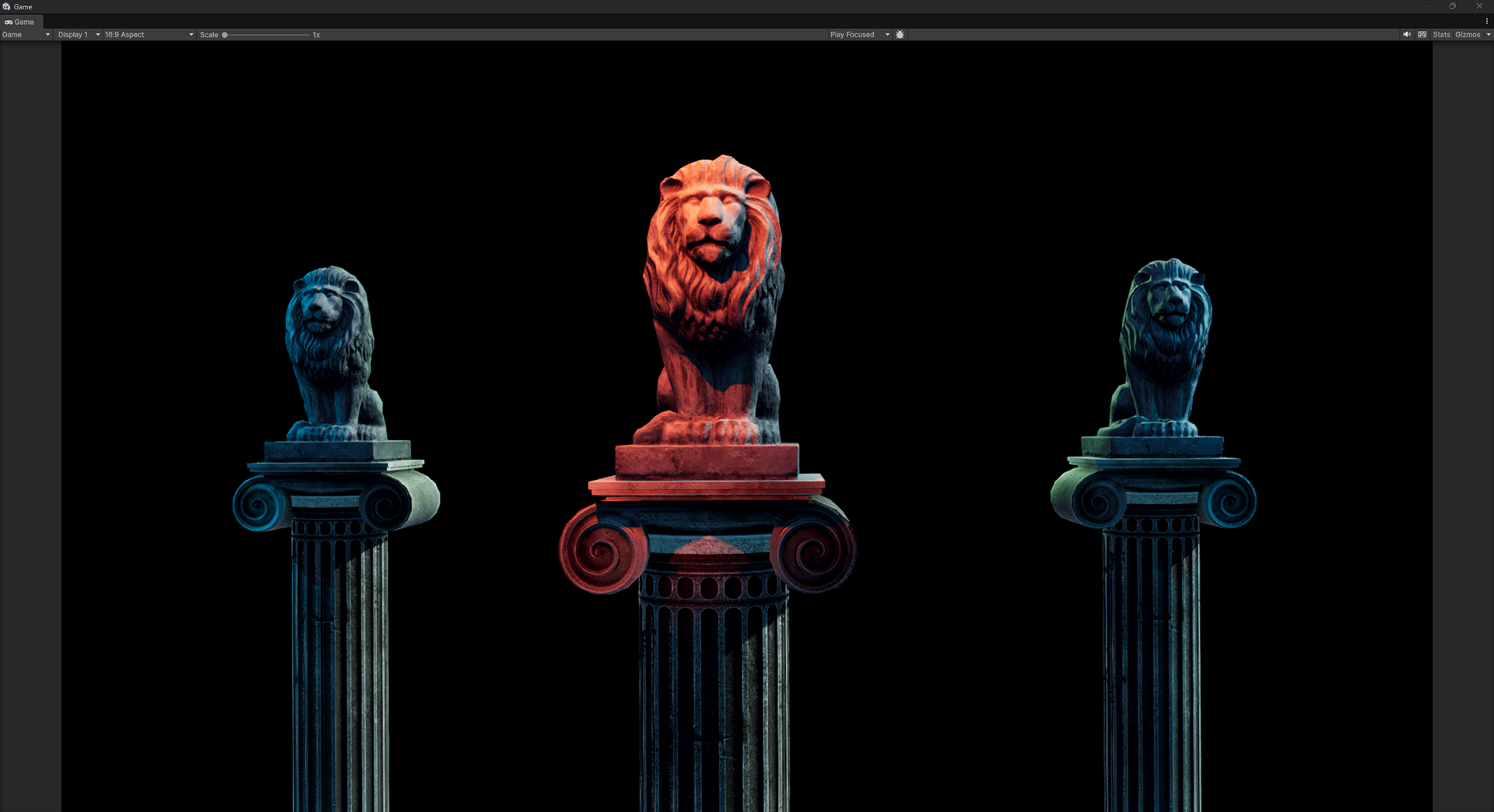
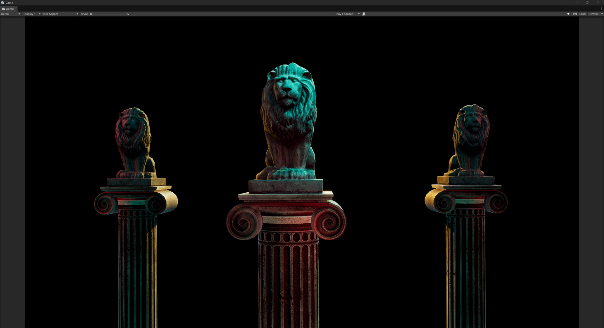
A tetradic palette is built of two pairs of complimentary colors. You could also see them as opposing analogous colors. In the example of this image, I am using opposing (but not directly opposite) colors as my main colors.
One opinion on tetradic palettes is that the the colors must be evenly spaced (90 degrees apart). In this case, it's referred to as a Square palette.